Sailor House is a conceptual high-end seafood restaurant. The project guidelines requested a nautical theme with a masculine audience in mind. The art was hand-drawn to help convey an upscale atmosphere.
THE LOGO, THE COLOR PALETTE, AND THE FONT
The Sailor House project required a design with a nautical theme specifically tailored for a masculine audience. To achieve this, a carefully selected palette and font were chosen to reflect the nautical inspiration. The color scheme and typography were designed to evoke a sense of maritime adventure and sophistication, aligning with the restaurant's upscale and masculine aesthetic. The design successfully captured the desired nautical theme, creating an inviting and cohesive atmosphere that appeals to the target demographic.
THE MENU
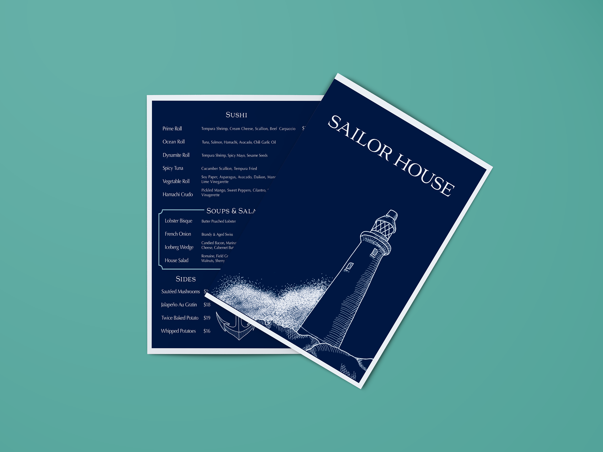
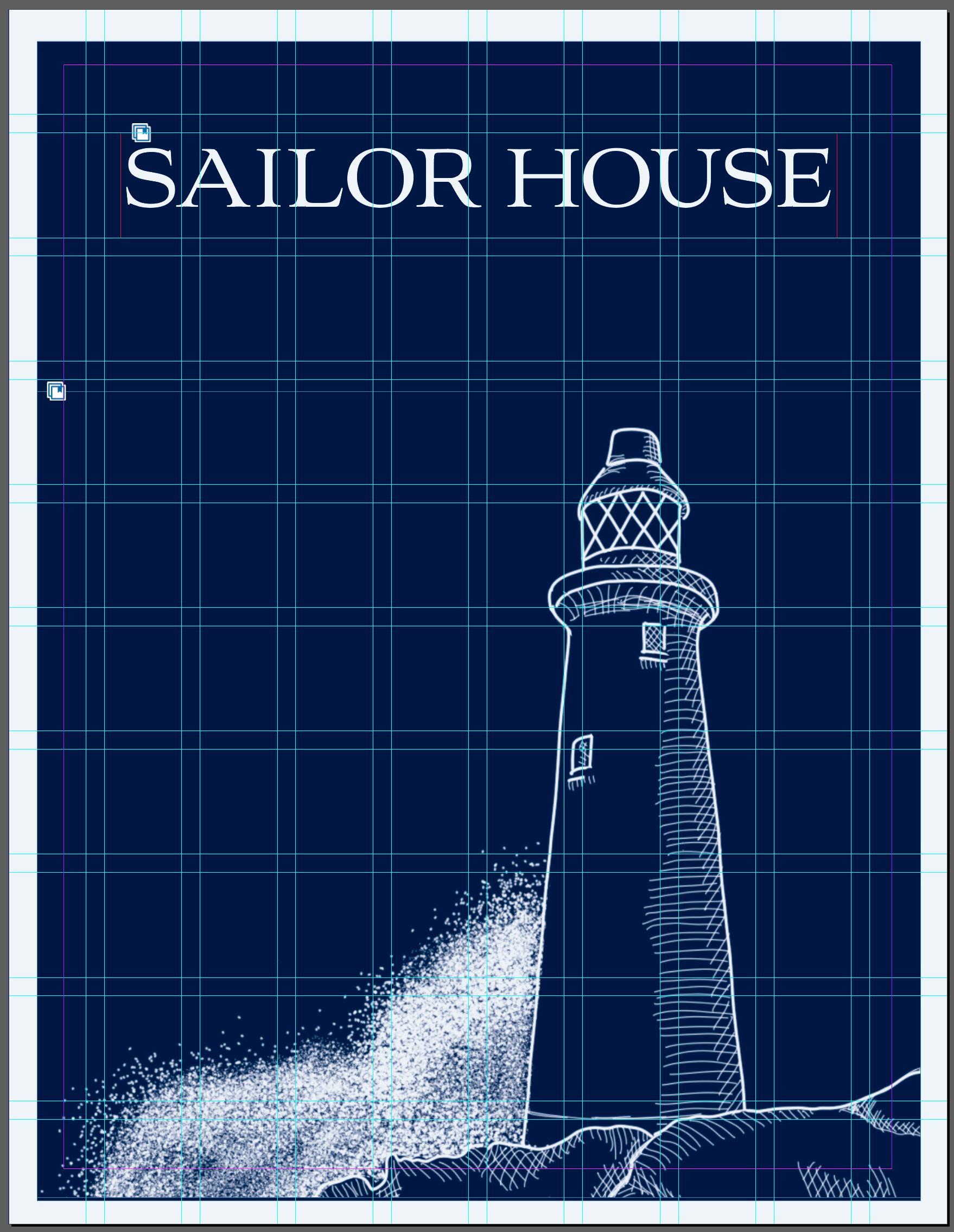
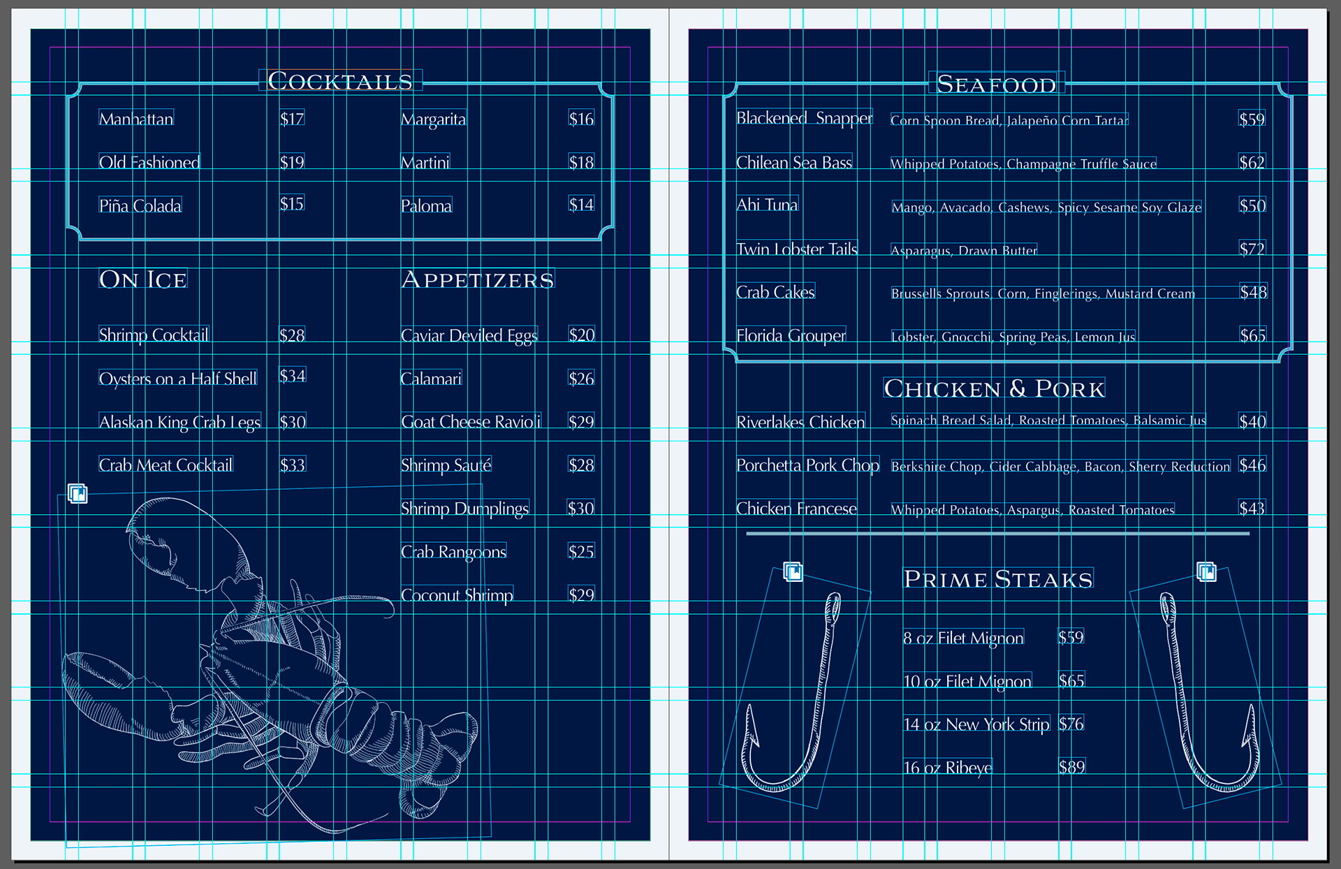
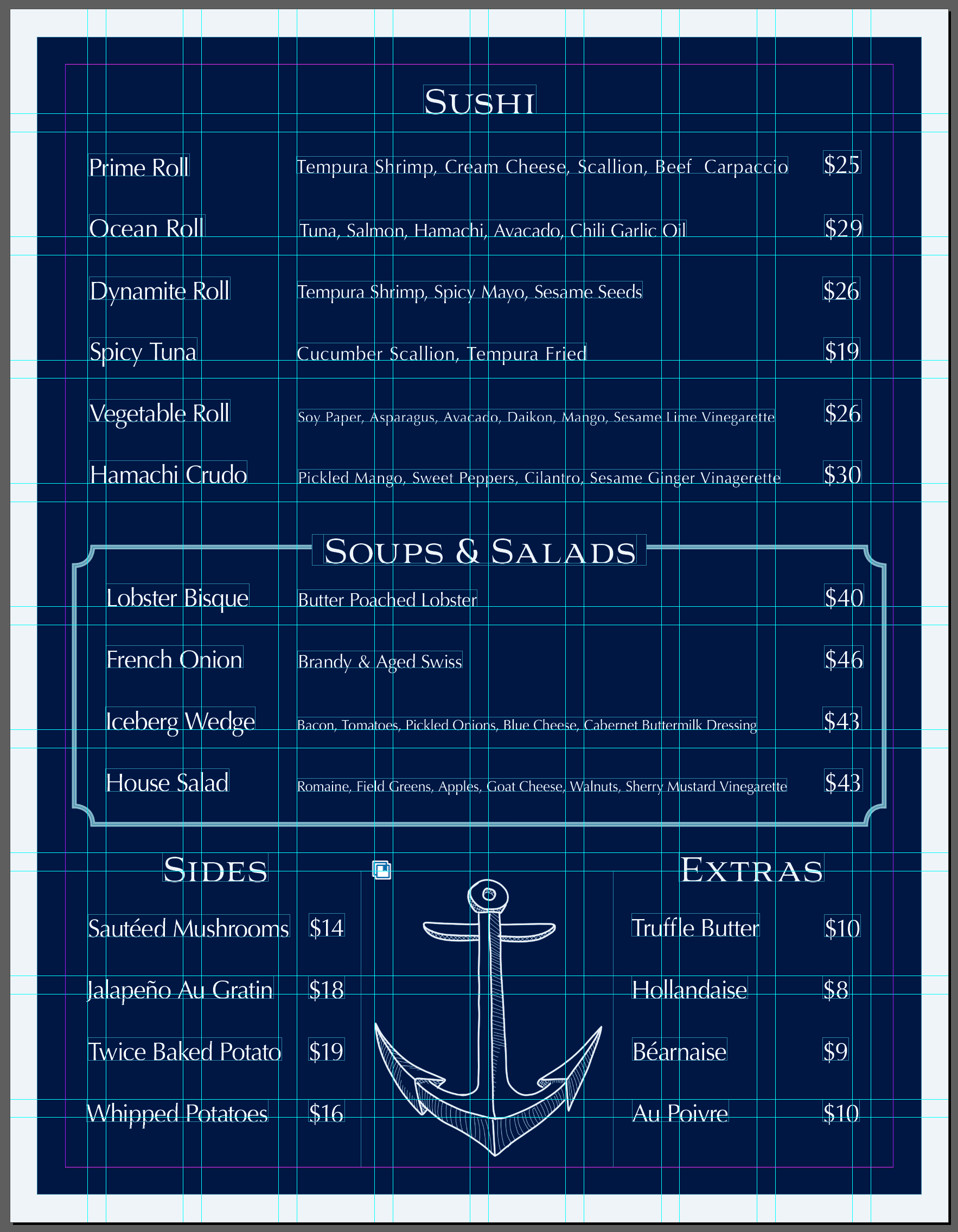
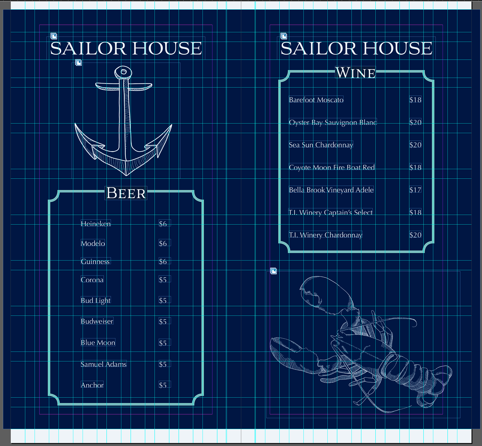
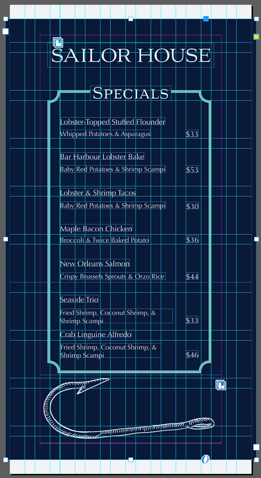
The Sailor House menu required a design that emphasized its nautical theme while maintaining an elegant and sophisticated feel. To accentuate the nautical theme, I carefully illustrated sea-related objects and animals using Photoshop, employing hatching and cross-hatching shading techniques to provide an upscale feel. The menu layout was created in InDesign using a grid system for organized and structured design. Consistency was maintained with the brand's color palette and font styles throughout the menu. The menu design successfully conveyed the nautical theme with a refined aesthetic, enhancing the restaurant's brand identity and providing a cohesive, visually appealing dining experience.
THE COASTERS
The objective was to maintain visual continuity with Sailor House restaurant's branding while enhancing guest experience through cohesive design elements. Inspired by the restaurant's menu illustrations, the coasters were designed to seamlessly integrate into Sailor House's ambiance. Existing artwork styles were carefully replicated to ensure consistency, while new illustrations were introduced to add diversity and maintain aesthetic harmony. By leveraging familiar visual elements from the menu, each coaster became an extension of Sailor House's identity. The newly crafted illustrations complemented the established style, offering patrons a delightful variety without compromising on brand coherence. The coasters not only enriched the dining experience but also reinforced Sailor House's brand presence. Guests appreciated the cohesive visual narrative, fostering a stronger connection between the restaurant's ambiance and its design elements.
THE TAKE-OUT CONTAINERS
I sought to maintain brand consistency across all touchpoints, including takeout packaging, by integrating familiar visual elements from Sailor House's restaurant ambiance. Drawing inspiration from the restaurant's menu and coaster designs, the takeout containers were crafted to reflect Sailor House's distinctive aesthetic. The navy blue color from the previously selected palette was chosen to ensure standout visibility, complemented by prominently displayed logos on all sides. The incorporation of existing artwork seamlessly extended Sailor House's branding onto takeout containers. Each container serves as a portable representation of the dining experience, featuring cohesive visual elements that echo the restaurant's inviting atmosphere and menu illustrations. The takeout containers not only reinforce Sailor House's brand identity but also enhance customer recognition and loyalty. The striking navy blue packaging, adorned with prominently featured logos, unified the brand's messaging across physical and takeout dining experiences, fostering a cohesive and memorable impression among patrons.
